A full moon is VERY bright, if you allow the camera to meter the shot, it's going to meter the night sky, you need to go into manual. The settings I used are above the picture.
B&W, leave the flower it's that little extra detail that make it more natural looking! I think if you crop out the flower you'll need to take too much of the little boys shoulder with it and you'll lose the nice framing you have.
Have you thought about adding an age effect, you know that brownish tint, to it? I think it would make a classic.
yah...i have a great B&W program and i tried multiple effects including sepia. i went with this yellow filter one. sepia almost always looks too cheesy and cliche for my tastes anyway..thanks for all the great feedback though...my only other issue with this picture is that i told my sister in law i was going to be photographing her son, and she dressed him in the loudes spiderman shirt in the whole world....i think i single color shirt would have greatly helped this....
Looks a little too blue, might try makeing the colored part of the eye smaller, especially on the left, might also look into trying to increase the contrast behind him.
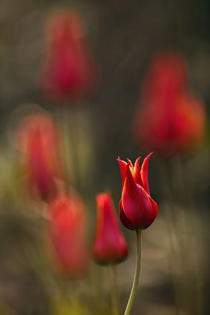
The only thing I could possibly guess would be all the space above the primary subject, alot of room at the top, but the other blurred images make it work, for me anyway.
Thanks guys; fun thread here. My problem is that the primary subject very slightly overlaps one of the out of focus secondarys on the left. That's all my eye goes to.
Id like to submit my first two photos I took last night from my Nanocube. Its got the stock 50/50 lighting for reference. I took the shots with my CanonG3 in autofocus , in macro mode on a mini-tripod using the remote control shutter. I preface this saying I know as much about photography as I do reefkeeping so please speak in simple to understand terms ! I took the smallest images available and used paint to reduce them to fit the website requirements. They are very simple and mundane compared to what is posted here but I can learn a lot I think and thank you in advance. Peter
")